
“A design system isn’t a project. It’s a product serving products.”
– Nathan Curtis
Say hello to Indigo – Sendinblue’s all-new design system that we’ve built from the ground up hence it is the framework that helps our ecosystem to design and develop consistent and quality experiences.
What is a design system?
A design system is a cleanly documented series of reusable components and styles which follow specific guidelines as a result they can be grouped in different combinations to build a large scale of applications.
Why are we creating a design system in Sendinblue ?
As our team grows at Sendinblue each person comes up with a unique way to solve the problem which can result in in-consistent experience to the end user when they use the product. Design System is a way to manage design at scale.
Design elements are the foundational layer of Indigo which are build on Figma by designers to make sure the foundation layer is consistent and intuitive.
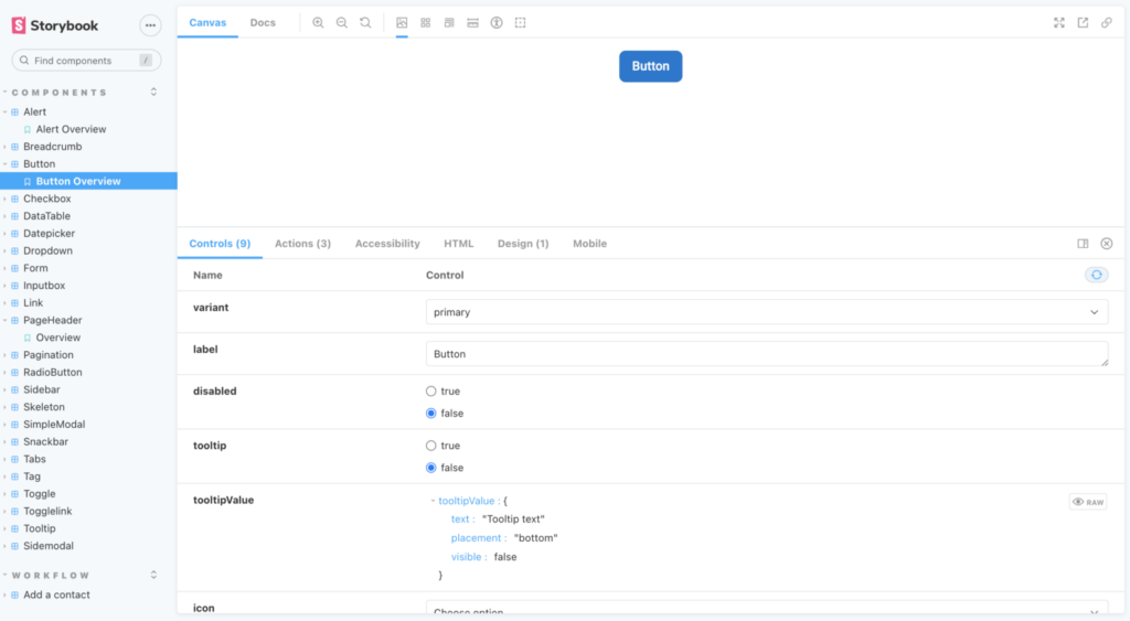
We have the component library of reusable atomic components which is build on React framework and documented on Storybook so that complex components can be build using these components in different combinations
Design principles
Indigo has following principles like:
- Clarity — refer to how accessible and comprehensible the informational given design is for the stakeholders.
- Scalability and Modularity — Implies that our platform evolves with the users. It should be easy to use for a new user and tailor-made for a “pro-user”
- Close to our user — Our designs are carefully designed to maintain the balance between aesthetic appearance and visual complexity hence makes it user-friendly.
- Playful — To achieve goals and learning for our user we have added playful-ness which helps the user to learn by doing some actions which unlock further actions.
Design Language
Design language is one of the core pillars of a design system albeit it consists of components that you’ll use to construct your digital product.
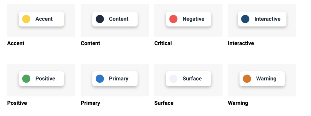
- Colors : Indigo features Sendinblue brand colors to create a truly immersive experience therefore we use 8 different core colors that define our platform. Each of them has its own role, and it serves a concrete purpose.
- Typography: Indigo provides a constrained, purposeful set of typographic styles. These styles map to functional roles so you know when to use what.
Headings
We use Publico in Medium weight as our font for headings an in addition we have 6 different sizes of headings, each of them serves a concrete purpose inside of Sendinblue.
Body
Our body font is Roboto. We use the font weight as 400, though some components of the Design System use the weight 700. Body text can be present in two different sizes, and in several colors described in the usage section.
- Iconography
We recently rethink icons inside our Design System according to the new Design principles hence decided to choose an Open Source library (Feather Icon) composed of simple and modern outlined icons.
Architecture Diagram

Indigo is the framework that helps our ecosystem to design and develop consistent and quality experiences.
This library is set up usin lerna mono-repo with tooling to quickly jump start a new package. The benefit of using a mono-repo was that it gives developers a single place to discover what components are available when building out applications.
We also decided to version each package independently, which helped avoid issues with updating Indigo or in downstream applications.
Packages
Css specific styles
These packages allow the consumption of elements with a higher level of granularity as a result you will get only the styles you need and what you consume is Pure CSS
Icons
This package provides you with a library of SVG icons that you can include in your respective application
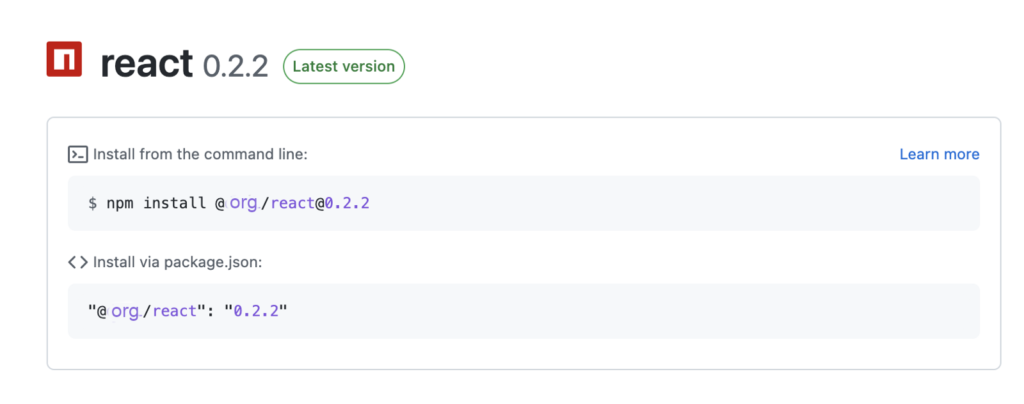
React
This package provides you with a library of React components:
CI & CD
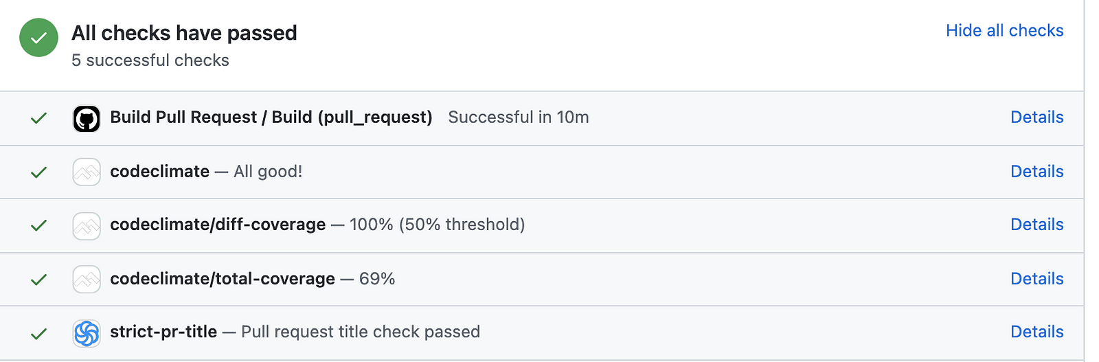
CI/CD contains defined steps which will automatically run every-time when we push out code changes in our repo.
For building (CI part) and deploying (CD part) changes to Indigo we make use of Github actions.
How do we use Github actions?
GitHub Actions are event-driven, meaning that you can run a series of commands after a specified event has occurred in the repository example: while pull/merge request is created or merged.
GitHub automatically executes all kinds of actions by creating, destroying, cleaning up virtual machines.
These actions can be created by the following actions mentioned below.
- Either Clicking on Link to set up a workflow yourself in GitHub repo’s action tab
- Or via a YML file as a part of your repo
We are using the second approach by adding our YML files to the .GitHub/workflows directory. The folder contain three files:
- build-pr.yml: Building our solution
- release.yml: Releasing changes and publishing packages
build-pr.yml
The workflow triggers a job to build that runs on ubuntu for every newly created pull request of indigo repo. The file execute various steps as described below:
- checking out the version of branch
- creating a node env
- installing npm and yarn dependencies
- Building sources (Individual components )
- Running test cases
- Building docs (Storybook)
release.yml
The workflow trigger’s two jobs to publish_github_packages and publish_github_pages for releasing the changes of individual components.
The job is triggered every-time the code is merged to the main branch. The jobs are explained below:
Publish github packages
The job installs node and yarn dependencies, runs and tests the builds and then releases the package via yarn release.
For publishing package to private repo the secret token required in “//npm.pkg.github.com/:_authToken=${{ secrets.GITHUB_TOKEN }}” is picked from GitHub secret on runtime.
Once the release is completed the packages are versioned in Github as below:
Publish github pages
Deploy storybook showcase changes to our Indigo domain.
Code Quality
We are using Code climate to maintain the maintainability and test coverage of the code. The tool scans the smelling code and code coverage while build is creating and generating a report.
Docs
The docs showcase every component imported via the above published package and also contains examples of code to make the system easy to integrate.
- HTML/CSS showcase
- Icons showcase
- React Showcase
Document components
Using Storybook we have documented each and every component in Indigo.
What next?
We’ve already been able to rely on Indigo for all new products and will continue to do so as a next step we are going to adopt our design system in existing products as well.
Stay tuned to our blog for more insights on our design system.
References
- https://www.uxpin.com/studio/blog/best-design-system-examples/
- https://zeroheight.com/blog/decathlon-design-system/
- https://material.io/
- https://ant.design/